
Hey guys, what’s up.. In this blog post I am going to talk about creating overlay spinner/loader in react native.
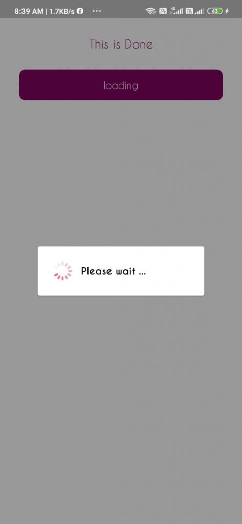
Let’s look at the preview of Loader/Spinner first…
Creating a overlay loader in react native is not that hard.
However most of the new developers tend to use npm ready made packages.
Once you get command on React native, it becomes easy to write on your own.
You can grab whole code from github link here
let’s not waste time and start coding..
As usual create a new React native project or open an existing project.
In this project we are going to use Overlay, Image, Card and Text elements from react-native-elements kit.
So, you can install it by the following command
yarn add react-native-elements

# or with npm npm i react-native-elements --save
Once you install react-native-elements, we can start coding now..
Create a file named Ospinner.js which is our Overlay spinner component. You can place it wherever you want but make sure you import it with right path.
Just open the Ospinner.js in your favourite editor, and copy paste the following imports.
import React, {Component} from 'react'

import {View, StyleSheet} from 'react-native'

import {Image, Card, Text, Overlay} from 'react-native-elements'

import PropTypes from 'prop-types'
We are importing only necessary components from react-native-elements package and PropTypes to recieve props from the parent component. And the remaining components are pretty much standard.
Now lets code our main Ospinner component class
export default class OSpinner extends Component {
  constructor (props) {
    super(props)
  }
  //Write code here
}
In the above code, you can ignore the constructor if you don’t want, Now lets code some default props for the OSpinner component. Copy the below code into the Ospinner component.
  static propTypes = {
    message: PropTypes.string,
    closeOverlay: PropTypes.func
  }

  static defaultProps = {
    message: 'Please wait ...',
    isLoading: false
  }
If we observe the code, the OSpinner component receiving two props, one is a message string and a closeOverlay function.
We have coded props type using const propTypes and default props values using defaultProps.
defaultProps is useful when the parent component does not provide any props.
Now lets code the render method.
  closeOverlay = () => {
    this.props.closeOverlay()
  }

  render () {
    return (
      <Overlay
        isVisible={this.props.isLoading}
        onBackdropPress={() => this.closeOverlay()}
      >
        <View style={styles.overlayContainerStyle}>
          <Image
            source={require('../assets/spinner.gif')}
            style={styles.image}
            transition
          />

          <Text style={styles.textStyle}>{this.props.message}</Text>
        </View>
      </Overlay>
    )
  }
Don’t panic on seeing the above code, it just a Overlay with Image and Text components Inside.
We have used a spinner.gif (link) file as a loader, you can use whetever image you like to appear as a loader.
Coming to the working part of the code, the Overlay will only be seen if the this.props.isLoading is true, we receive this value from the parent component.
When a isLoading props is received from the parent, the Overlay will be rendered again with new isVisible value of the Overlay.
Now lets add some Stylesheets to the OSpinner.js file.
const styles = StyleSheet.create({
  image: {
    width: 60,

    height: 60
  },

  textStyle: {
    fontSize: 16,

    fontFamily: 'CaviarDreams-Bold'
  },

  overlayContainerStyle: {
    width: 250,

    height: 60,

    flexDirection: 'row',

    alignItems: 'center'
  }
})
The above code will make Image and Message align side by sids and looks good.
So the Over all code for the OSpinner.js looks like below
import React, { Component } from 'react'

import { View, StyleSheet } from 'react-native'

import { Image, Card, Text, Overlay } from 'react-native-elements'

import PropTypes from 'prop-types'

export default class OSpinner extends Component {
  constructor (props) {
    super(props)
  }

  static propTypes = {
    message: PropTypes.string,
    closeOverlay: PropTypes.func
  }

  static defaultProps = {
    message: 'Please wait ...',
    isLoading: false
  }

  closeOverlay = () => {
    this.props.closeOverlay()
  }

  render () {
    return (
      <Overlay
        isVisible={this.props.isLoading}
        onBackdropPress={() => this.closeOverlay()}
      >
        <View style={styles.overlayContainerStyle}>
          <Image
            source={require('../assets/spinner.gif')}
            style={styles.image}
            transition
          />

          <Text style={styles.textStyle}>{this.props.message}</Text>
        </View>
      </Overlay>
    )
  }
}

const styles = StyleSheet.create({
  image: {
    width: 60,
    height: 60
  },

  textStyle: {
    fontSize: 16,
    fontFamily: 'CaviarDreams-Bold'
  },

  overlayContainerStyle: {
    width: 250,
    height: 60,
    flexDirection: 'row',
    alignItems: 'center'
  }
})
Thats it, now lets see how to use this OSpinner component. Below is the line how you use this in any component.
<OSpinner isLoading={true} closeOverlay={() => {}}You need to programmatically switch on and of the OSpinner component using the isLoading props.
Below is the simple use case from a Home.js component.
export default class Home extends Component {
  constructor (props) {
    super(props)
    this.state = {
      isLoading: false
    }
  }

  showSpinner = () => {
    this.setState({
      isLoading: true
    })
  }

  closeOverlay = () => this.setState({ isLoading: false })

  render () {
    return (
      <View style={styles.container}>
        <Text style={styles.textStyle}>This is Done</Text>

        <Button title='loading' onPress={() => this.showSpinner()} />

        <OSpinner
          isLoading={this.state.isLoading}
          closeOverlay={() => this.closeOverlay()}
        />
      </View>
    )
  }
}

const styles = StyleSheet.create({
  container: {
    flex: 1,
    alignItems: 'center',
    backgroundColor: 'white'
  },

  textStyle: {
    fontSize: 20,

    margin: 30,

    color: '#800460'
  },

  image: {
    width: 100,
    height: 100
  }
})
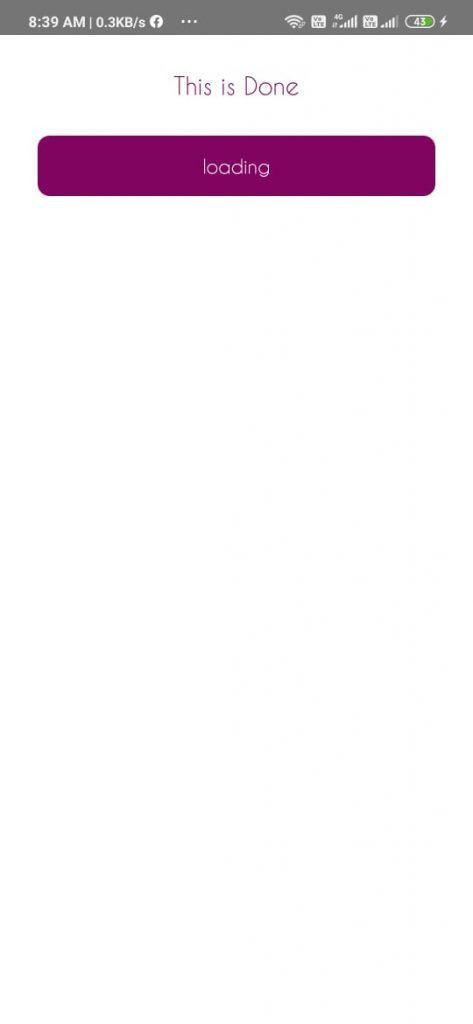
This is the preview of Home.js
We are using a simple Button to trigger the overlay by doing setState of isLoading to true.

And the closeOverlay is called when the user clicks outside the overlay, which trigger setState of isLoading to false.
Isn’t it simple?
That’s it friends, hope you understood this simple tutorial. For doubts, comment your questions.